So by now if you've been following my "adventures in food" series, you'll know that I can't shut up about Grand Central Market. It's weird, fun, hip (maybe a touch hipster), but also brings all walks of the community together. AND! The food! The food is amazing!
It won't be any surprise then that this post is once again about something at GCM. Today's subject is the sleek, ultra fancy-looking PBJ.LA! I know what you're thinking, "Wait doesn't that look like (rhymes with fun-bust-ables)?"
Sure, it may LOOK like that unnamed item from the freezer section that you ate as a kid (or as an adult, I don't judge), but the roundness and crimped edges is where the similarities end.
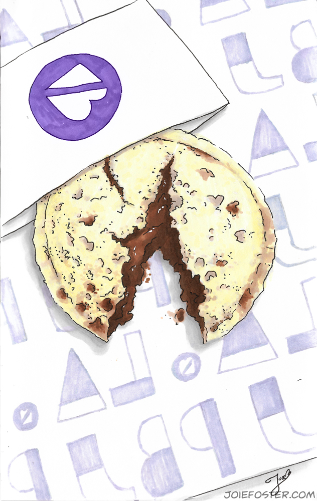
Enter, the Chocolate Haze.
When I first spied PBJ.LA, I was impressed with their exceptionally slick branding. Fancy logo, purple lights, and white, glossy walls-- it's the works. As a freelance artist, I understand how important branding is, and these. guys. NAILED. IT.
So what do they have to eat? You guessed it-- peanut butter and jelly sammiches! But not just any regular ol' PBJs, these are made fresh from scratch with organic, non-GMO ingredients, and everything except for one item is plant-based. That one item is an optional add-on, and it's a buffalo smoked mozzarella (but there is a vegan cheese option!). Everything is pinched into a cheerful circle, and there's just something intensely satisfying about that to me.
I had already eaten dinner when I approached their stall, so I went straight to the dessert option they had: the Chocolate Haze. It's a house-made chocolate hazelnut spread paired with dark cherry chianti jam. The bread was fluffy, and insides delightfully gooey.
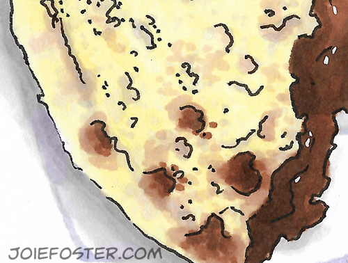
Look at the hazelnut yums seeping through!
Instead of the sugar explosion I was expecting (as a lover of Nutella), I was pleasantly surprised to find that their hazelnut spread didn't scream of sweetness. My taste-expedition was complicated, deep, and very flavorful. It included a slightly bitter note of cocoa, the hum of hazelnut, and a mild sweetness from the jam. I'm not sure what I was expecting, but this round sandwich knocked my socks off! I immediately wanted to try everything on the menu, but sadly didn't have enough room in my stomach.
And of course, when you eat PBJ, what do you also want? Milk! I can't have regular cow's milk anymore, so I was in luck... their other major offering is an Almond Milk bar. They have Vanilla Almond, Strawberry, Cafe au Lait, and of course the one I tried: Peruvian Cacao. The flavor of the milk was deep, rich, and chocolately-- but again without overwhelming sugar. It made me SO happy to drink.
My experience there was super nice. I met two of the founders, Payvand and Jimmy, and they were open, honest, and really enthusiastic about talking to customers. I love their friendly manner and willingness to answer questions. I was of course concerned about what they do with the discarded crusts-- and it turns out they're developing another great product that will come with your sandwich so nothing is wasted!

Ooey gooey deliciousness...
Creating the accompanying illustration to this post was a challenge, as bread is such a delicate subject to render. I wanted to reflect the bright purples of their logo (I don't get to use that marker much in food illustration), but didn't want the shadows to be so cool that they looked moldy. I also wanted to reflect how light and fluffy this bread was without over rendering it-- cue me testing different yellow and brown markers for an hour before I even started!
Also, rendering their logo backward on the paper was a huge pain, but I feel like it added a great visual texture to the illustration.
Anyway, I can't wait to visit GCM again so I can try some of their other sandwiches and almond milks. PBJ.LA, watch out, I'll be back!