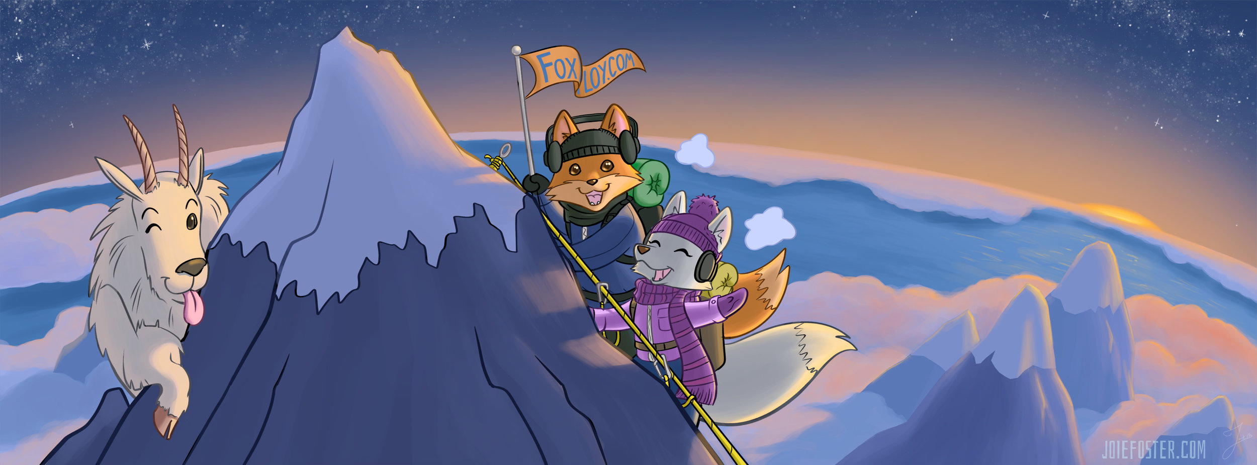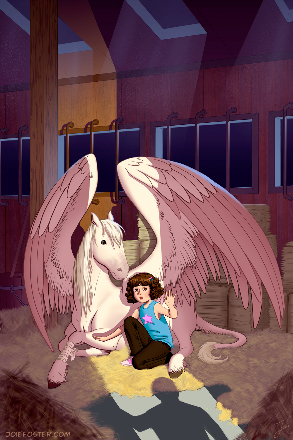
Please raise your hand if in your childhood you wished to discover and care for a secret magical creature of your own? *both of own hands in the air* Now keep your hand up if you wish for the same thing as an adult? No? Only me? C'mon there's gotta be at least some of you...

Did enough iterations to just about animate the pegasus' wings flapping!
I painted this about two months ago as an assignment Just For Myself (TM). Getting to work 100% for yourself is simultaneously exhilarating and terrifying. You can paint whatever you want! Also, you can... paint whatever you want... and you could easily get trapped because that gives you zero parameters and you'll self destruct in a never ending cycle of indecision.
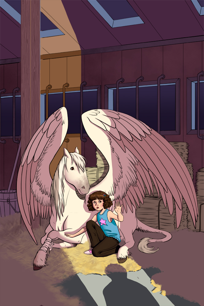
Finally ended up on this-- a cover image for a faux middle grade novel I invented: a girl finds an injured pegasus and has to nurse it back to health. Unfortunately for her, she lives in the modern world which has no magic, so she has to go to extreme efforts to keep the thing hidden. Fun right? Definitely a story I would've gobbled up as a kid. And also now.

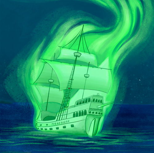
The colors, Duke! THE COLORS
So since this was Just For Myself (TM) and I had no deadline, I spent lots of extra time in the planning stages. As you can see, I did 9 different thumbnails to figure out my composition, but that does not count the other 20 or so I did to figure out what scene from my fake story I even wanted to show! If you're imaginative, you can almost follow along with my thought process:
Okay so they're in a barn together, and I want to show them getting spotted because WHOA that's drama! Ok so first let's see them in a horse stall and see a shadowy figure at the barn's opening. Hmm, ok should the pegasus' wings be unfurled or hidden under a blanket? Hidden under a blanket might make storytelling hard because people won't know it's a pegasus. Unfurled sort of cuts the whole picture in half, especially with those beams in the middle... hmm ok let's take 'em out, switch 'em around... trying adding in foreground elements. Nope ok, none of this is working, let's try a different angle. What if we're looking at them from close to where the shadow figure is standing? Ok we're back to the wing thing again...
After I'd nailed down what composition I wanted, I did 7 more thumbnails for values, half of which required a more refined drawing. I wanted to try out different dramatic lighting schemes to see what told the story the best way. I also tried a tilted angle (sometimes known as Dutch Angle), but decided it looked like a slasher movie. Scree! Scree! Scree!

The final "rough"
Then I went through 6 different color schemes before settling on my final "rough." I was ready to go! Well, except not really. I wanted to make sure the perspective on this piece was perfect. Yes, I COULD have done it by hand... but ain't nobody got time for that. So I busted out my ol' copy of SketchUp to model the interior of the barn. Once the model was done, I was able to finally do my pencil sketch on top of the entire thing to get it moving!
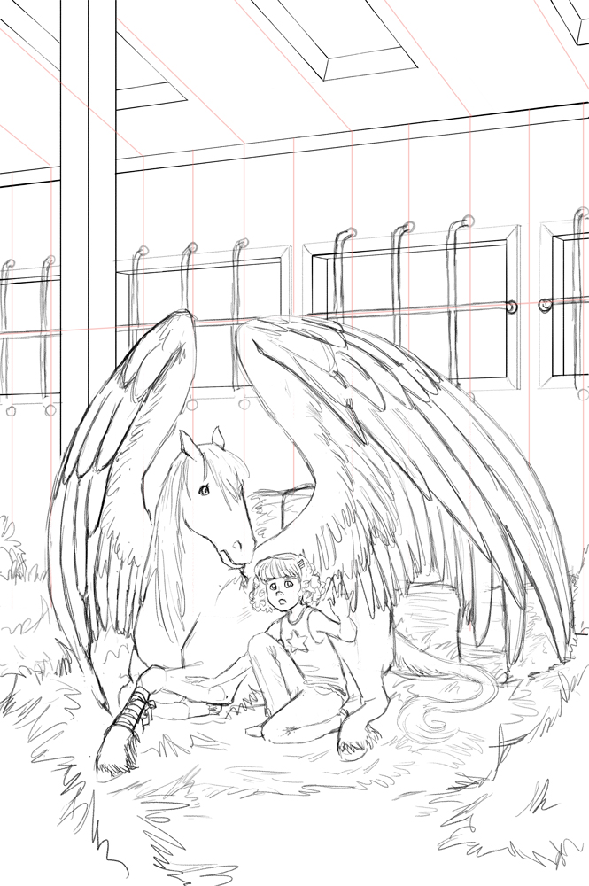
Hay Girl Hay! Since they're in a barn! I don't apologize for my puns. Pencils stage.
It's at this point that I'd like to point out that I had a TON of help and feedback from what I call my Circle of Trust (thank you Oatley Academy for coining that phrase)! It's important to get outside feedback from trusted artist friends about how a piece is going... especially when there's no client. I showed every single step of my process to my Circle, because I wanted this piece to be the best it could be! Think of it as using sandpaper; outside opinions and fresh, well-trained eyes are necessary to smooth a piece out.
To my Circle: You know who you are since I was emailing you about 20x a week. Thank you! <3
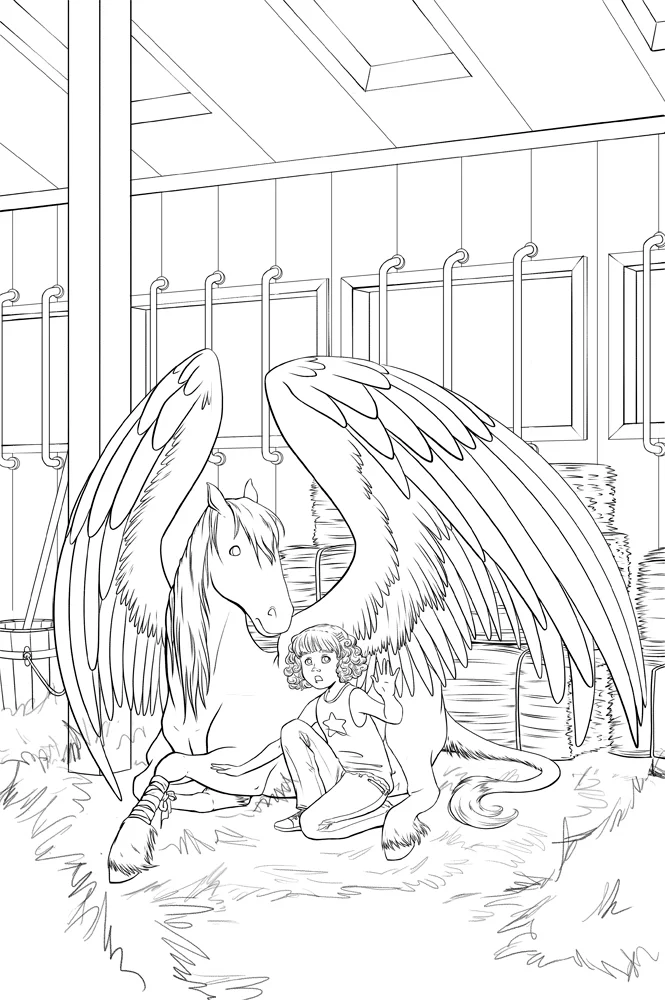
"Inks" is a weird term when the whole process is digital. Just think of it is as "smoother, nicer" pencils?
So once I'd gone through all that, I inked the piece. I ended up electing not to ink the hay, as I wanted to achieve the texture through painting. I kept the figures on a different layer than the background, as later I knew I intended to do what's called a "color hold" aka colorizing the lines. You seen any 90s Disney movies? Then you know what I mean.
"Nighttime" flat colors
With this particular piece, I ended up using an approach that was a hybrid of how I do both comics and painting. I flatted the painting, which means I separated out all of the local colors of every object so I could render them later. When choosing my flat colors, I went with what everything would look like in the dark, and then paint in the light afterward!
Rough lighting pass
Which is what this shot is here. You can see that the flat nighttime colors inform the shadows, but the "lights" make those colors make sense. Here I'd started rendering, the hay is starting to take shape... and you'll note that all the lines are still black. Don't worry, you'll see the color held lines in the final piece!

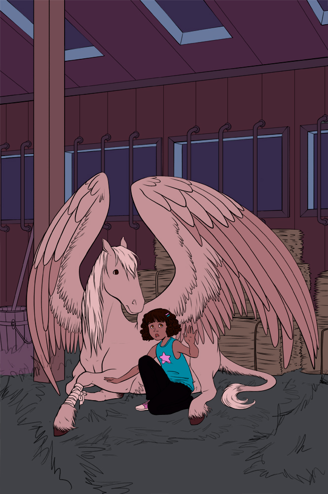
It's finished! Whoopie!
So about 10 hours of rendering, tweaking, and 20 zillion more rounds of feedback, I arrived at the finished piece! You can see that the lines are no longer black-- it's subtle, but the color held makes the drawing of the figures less harsh against the more painterly background.
Also a little birdie told me that people enjoy seeing animated GIFs of a painting's progress (I've only done it once before), so here you go! Hope you enjoy it. If you like it, I'll try to make them more often!

The process with more in between steps added!
Do you like it when I make "client-free" work? Do you like pegasuses? Pegasi? (Whatever the word is). Do you like process posts and animated GIFs? (Pronounced like GIF, not JIF, this isn't peanut butter thankyouverymuch). Feel free to leave a comment and tell me your opinion! It's the internet, sharing opinions is everyone's favorite thing. Don't be shy, I'll respond!